Whether you wish you had a better sofa, or you have the sofa of your dreams, there are many ways to make your sofa look more elevated. In this blog post, we’ll go over all of the different components that go into helping your sofa look more curated, cozy and high end. Keep reading for plenty of sofa styling tips.
Area Rug Size & Placement
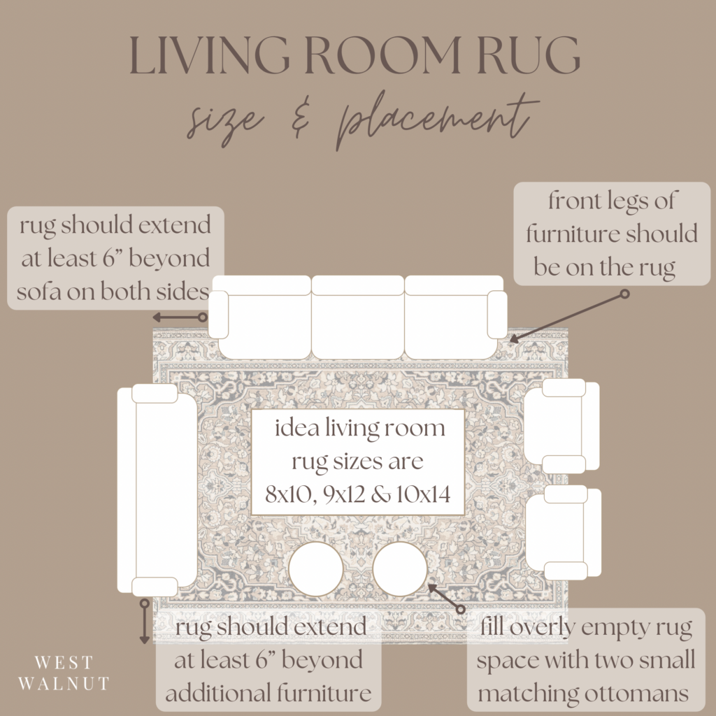
Both the size and placement of an area rug under a sofa are important for maintaining a high-end, styled look. Too large or too small of a rug under a sofa can make a room feel unbalanced. However, even with the perfect rug size, if the sofa is improperly placed on/near the rug, the room will once again feel unbalanced.
The easiest way to ensure proper rug size is the 6′” rule. If you buy your rug first, buy a sofa that spans at least 12″ less than the rug. Or, if you buy your sofa first, buy a rug that is at least 12″ longer than your sofa. This way, you can allow for the rug to extend past your sofa by at least 6″ on each side. As far as placement goes, make sure the front legs of your furniture are on the rug as shown in the diagram below.
I have created some visual examples down below to help easily understand what proper rug size and placement should look like. When rug size and placement are executed correctly, the space will be maximized and balanced.

Throw Pillows
Throw blankets and pillows can enhance the overall vibe of your sofa, making it feel more cozy and inviting. Additionally, they are a great way to incorporate pattern and texture into your space.
Before jumping right into patterns and textures, however, you must consider your color palette. I typically recommend selecting an anchor color in the room to incorporate into your pillow selection and two additional colors.
There are two main ways to approach this color selection. For a bold look, you’ll want to combine contrasting colors that are opposite each other on the color wheel. For a more flowing, subtle look, opt for color shades that are neighbors on the color wheel. You can even pick one color and select variations of that color, like terracotta, muted peach and earthy rust. This adds dimension without throwing in too many colors.
Don’t forget to mix textures and subtle patterns for added visual interest. This example below from Pure Salt Interiors is a perfect display of texture, color and pattern mixing throw pillows. As you can see, colors from the rest of the room are pulled in for a cohesive look.
When it comes to throw pillow sizes and shapes, you’ll for sure want to include a couple standard 24″x24″, 22″x22″, 20″x20″, 18″x18″ square pillows and a 12″x20″ lumbar pillow. But for a more curated, interesting look, consider incorporating round, spherical and bolster pillows into the mix. To be mindful of swapping out colors and textiles seasonally, I recommend purchasing quality pillow inserts and simply swapping out out zippered covers. Parachute Home has great quality down and down alternative pillow inserts which are linked below.
I know all of this variety sounds like a ton of pillows, but it’s not. Be very careful to create a sense of cohesiveness and flow within your pillow groupings, because the ideal number of pillows on your couch is 5. You want each pillow to incorporate the color story of the room, not distract from it. Ideally, grouping 2 pillows on one side of the sofa and 3 on the other creates a sufficient statement without taking away too much seating room. You want your sofa to feel inviting, and too many pillows can have the opposite effect, as it subconsciously looks like there’s not enough room to sit. I’ve linked some beautiful earthy toned pillows for inspiration.
Throw Blanket
Throw blankets are once again another opportunity to tell the color story of the room. You can even select a throw blanket that helps your pillows tie into the room with a cohesive colored pattern. While a styling a throw blanket on your sofa may sound like a straightforward task, there are actually quite a few ways to style/drape them. Here’s a list of the best ways to style your sofa throw blanket.
1. Fold blanket into thirds lengthwise and drape it straight form the back down the front of the sofa. Be sure to execute this drape off to one side or another, not centered. You can even add pillows on top like the example featured below.
2. Toss your blanket at an angle from the top corner of one sofa side in a perfectly imperfect fashion until it looks inviting. This look is more casual and inviting.
3. Sectionals have an addition option. You can fold neatly or casually fold the throw blanket over the foot area of the sectional.
4. Throws can also be a side attraction folded neatly or draped in a basket like the one featured below from Target!
5. Another side attraction option is a blanket ladder next to the sofa with a neatly folded or casually draped throw. I’ve linked an arched wood blanket ladder from Target below.
Side Table
Typically the rule of thumb for a side table next to your sofa is one that is just slightly shorter in height than the arm of the sofa. The photo below from Amber Interiors is a great visual representation of the side table being just slightly shorter than the arm of the sofa.
However, recent trends have been exploring side tables that are a touch higher than the arm of the sofa, which is a more bold, modern choice. Check out a beautiful example of this below from Studio McGee.
The most important thing to remember is regardless of which styling decision you choose, you’ll want to keep the height of the side table within 2 inches of the sofa arm height.
Lighting
So much creative liberty can be taken with lighting around the sofa. Mixing and matching lighting can help create visual movement and flowing height variations throughout the space.
You could of course put a table lamp on your side table next to the sofa (pro tip- select a lamp that is at least 1/3 the width of the side table). The same goes for if you have two matching tables on both sides of the sofa. If you choose to only have a side table on one side of the sofa, the other side of the sofa could have a floor lamp in place of a table. Additionally, wall sconces can be placed on either side of art above the sofa or even above an art piece to illuminate it. You can even mix and match these lighting ideas. In the photo below from @accordingtomandy on Instagram, you can see she utilized a table lamp as well as a wall sconce illuminating the art piece.
Art Above Sofa
Just like rug size, the size of the art you hang above your sofa is super important in attempting to elevate your space. Additionally, the gap of space between the top of your sofa and the bottom of the artwork is of equal importance. As you can see in the video example I’ve created below, art should span at least 2/3 the width of your sofa. Also, there should be an 8 inch to 10 inch gap of space between the top of your sofa and the bottom of the art. The 2/3 rule can be achieved with a single piece of art, art with wall sconces on either side, art groupings, or even gallery walls. Check out my video below for a visual example of each option.
Takeaway
With these simple sofa styling tips in mind, I hope you can achieve the beautifully styled sofa of your dreams. Start from the floor up. Tackle the rug to sofa size and placement first, throw pillows and blankets next and finally artwork above the sofa.


