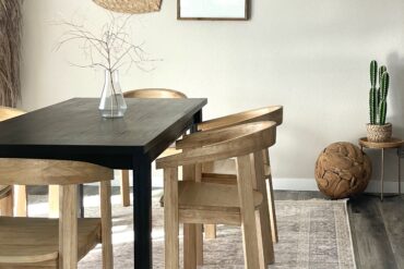
Creating symmetry in each space of your home is important in creating a sense of balance, organization & intentional looking design. However, we all know not every room is inherently symmetrical. Some homes come with odd architectural features and floor plans. Some examples of unsymmetrical room design challenges are; on uncentered window, awkward floor-plan, corner fireplaces and random light fixture placement. Don’t worry, we’re here to help you through some of these design challenges. With these tips in mind you’ll be able to create symmetry and help your space flow better.
Design Dilemma #1 – Off-Centered Window
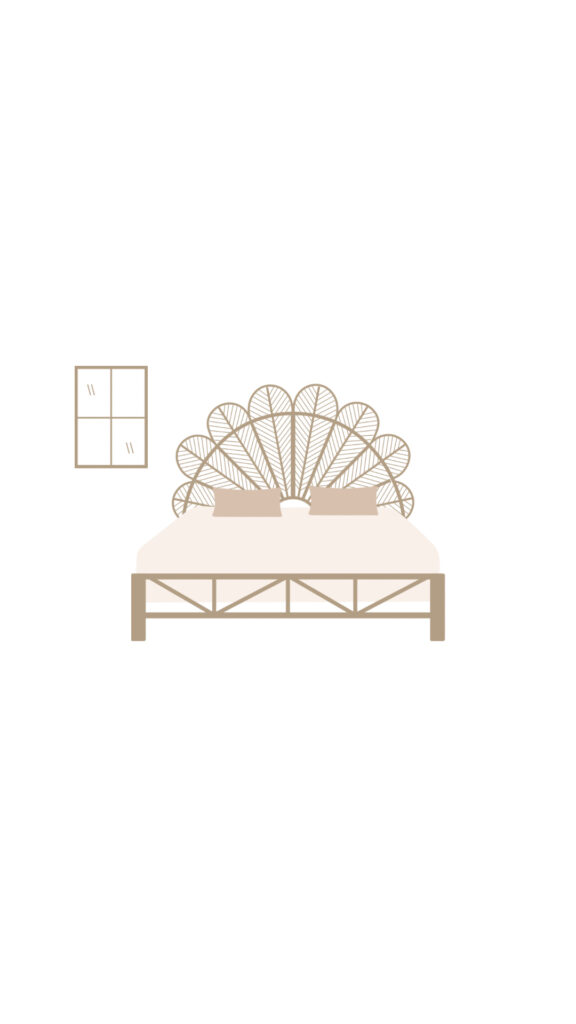
Bedrooms have a step up on achieving symmetry to most other rooms because the bed is naturally a centered, focal point. However, we know sometimes an obscure bedroom floor-plan or design could affect this sense of symmetry. One common problem we see, is a random window on one side of the wall, but not the other.
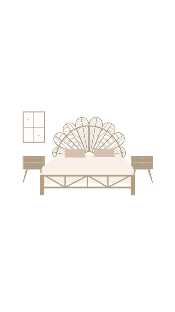
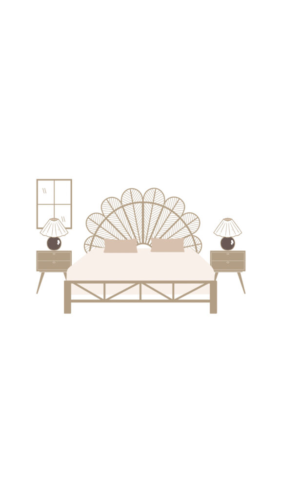
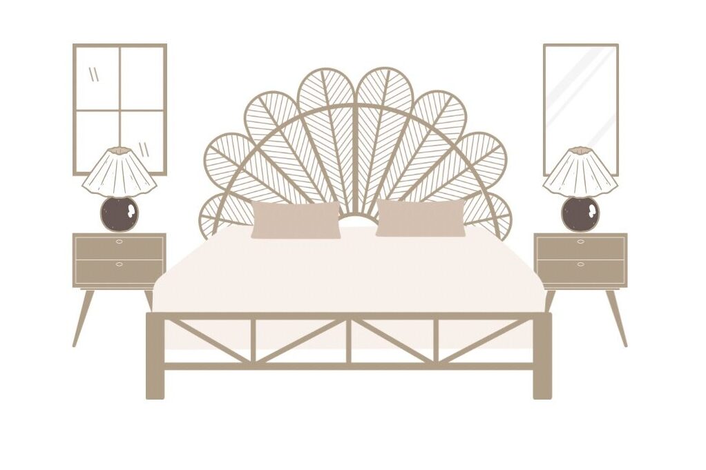
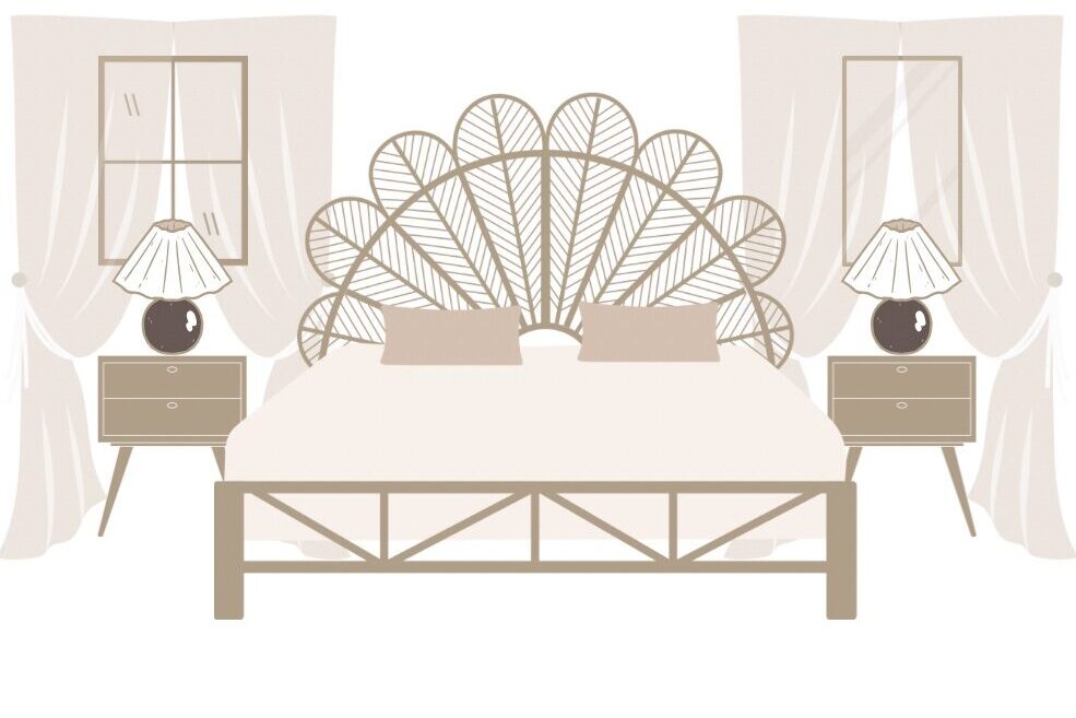
First things first, select matching nights stands and lamps for both sides of the bed (small accessories can be different in each side as long as they are around the same size & color family). In this situation, we’d recommend a mirror on the other side to create the illusion of another window. Both look like natural like sources since the mirror will reflect light. Next, drape them both with a set of sheer curtains. Try to select a mirror the same size as the window, but as you can see in the images below, even if they’re not perfectly equal, this trick works great! This gives the illusion of two symmetrical windows. The same can actually be achieved if the same window issue occurs in a living room or office space. Apply all the same concept, except use a sofa, or desk as the centered focal point instead of a bed. Check out the visual example we’ve created below to see how a sense of symmetry was achieved!
Design Dilemma #2 – Awkward Floor Plan
Conquering an awkward floor plan is no easy feat, but we have some tips that can help you work with the layout of an odd shaped room! The most important thing to remember while tackling this design dilemma is to work with the layout of the room, not against it. This is the art of creating flow through the room.
Try to identify or add in a focal point. Whether a fireplace, or a piece of large scale art, a focal point will help draw the eye into a specific point in the room that you can center your furniture and decor around. Sometimes with an awkward floor plan, a concentric shaped seating arrangement can draw the focus in and away from the walls.
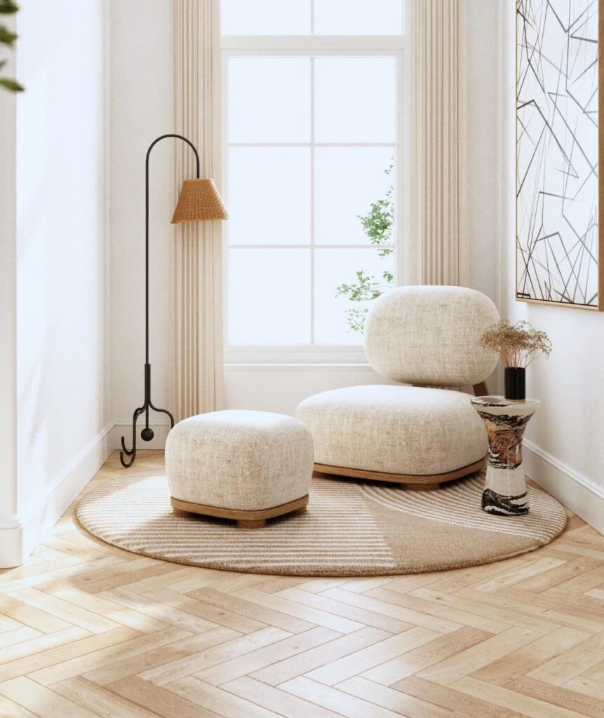
A room with odd nooks can benefit from an extra ‘zone’ like a reading nook, a large, bold statement lamp next to a small accent table, a stool and small plant, mini desk space or small bookshelf display. Even a small console table with some stylish, lidded storage baskets underneath could be a great plan for a nook area with added functionality. Check out this reading/lounge nook below designed by Anthology Creative Studio.
Design Dilemma #3 – Corner Fireplace
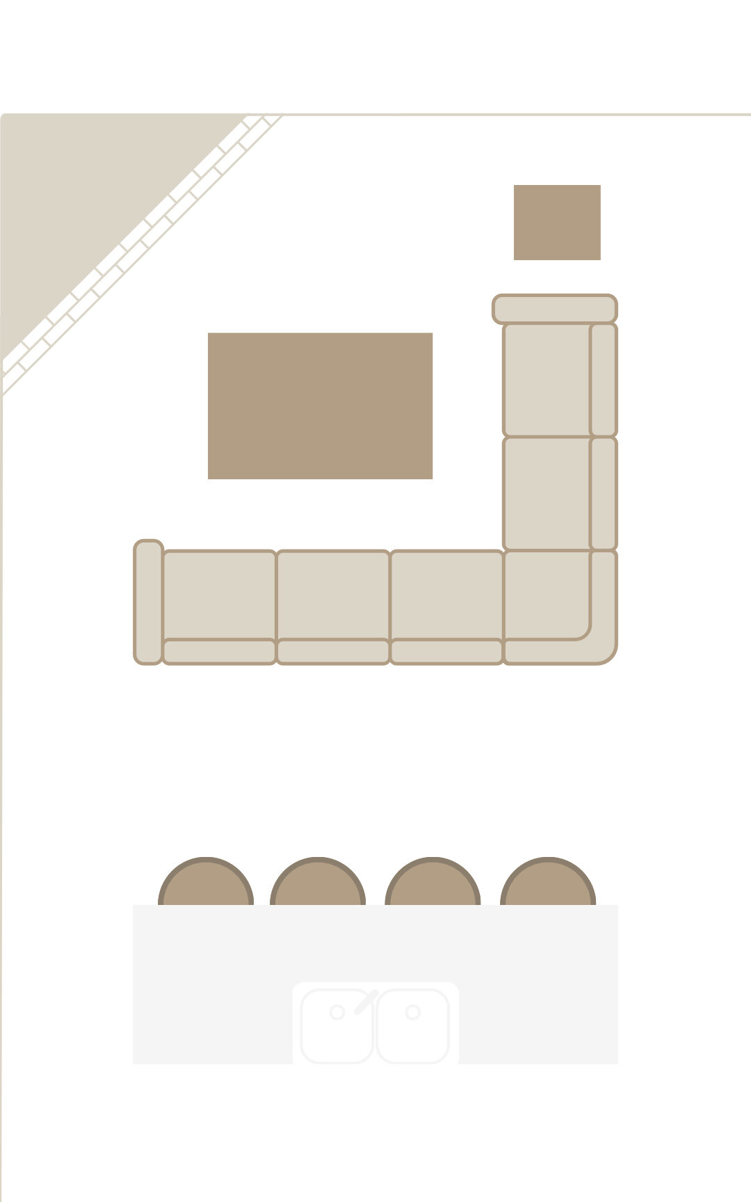
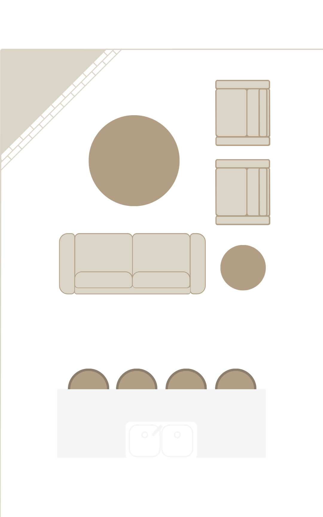
Corner fireplaces have been a design dilemma for decades. While this architectural element makes a statement in a living room or great room, it can be tricky to find a furniture layout that works well with it. We recommend formatting your living room seating in an L configuration. This can be done either with an L shaped sectional or a sofa and chairs.
To decide whether to use an L sectional or sofa with chairs, consider the walking paths through the too, where foot traffic will naturally flow. You want to avoid blocking off any walking pathways. Also be sure that a table can be reached from every single seat. Check out our graphics down below for reference. Remember, the goal is to create symmetry so place artwork and lighting strategically in this case to do so.
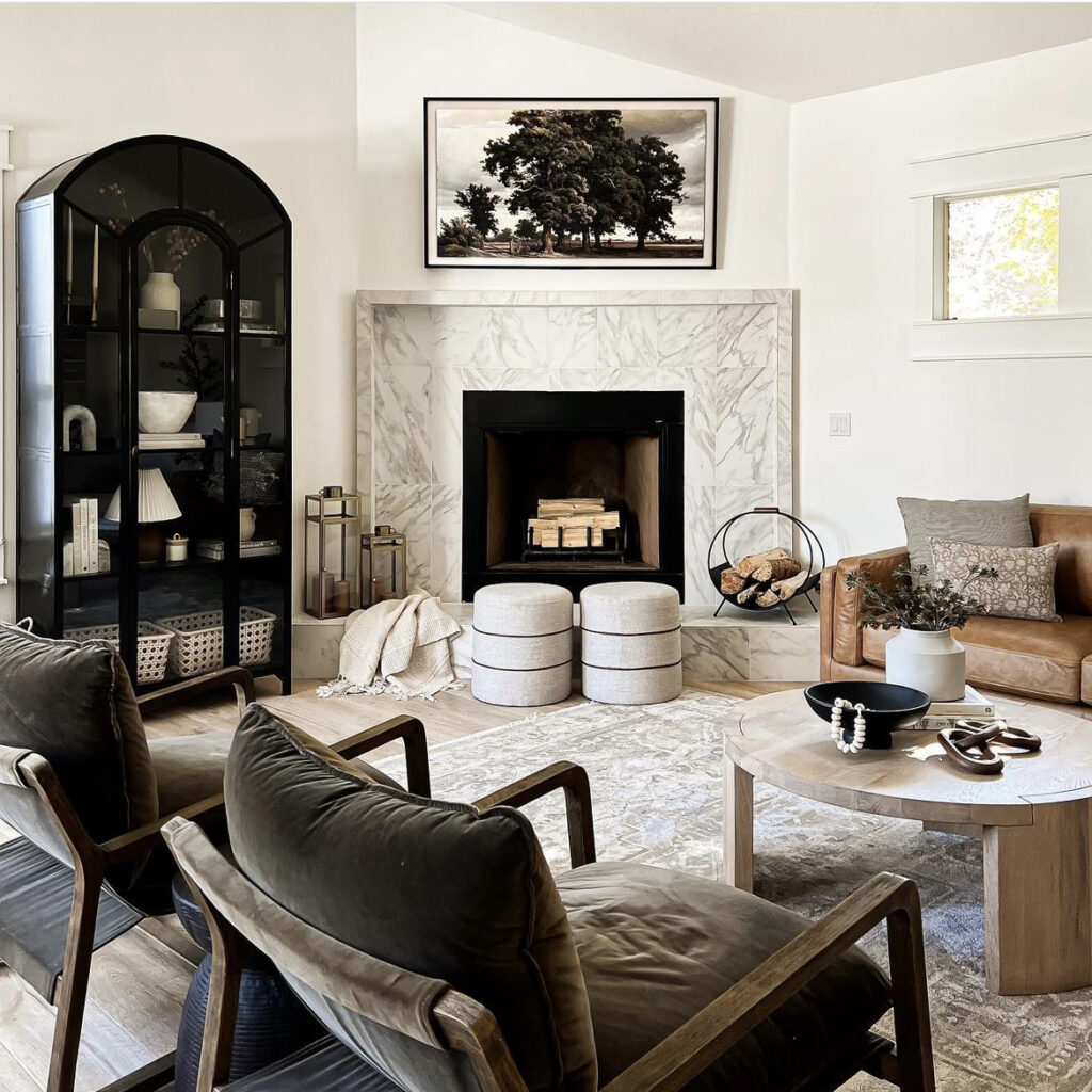
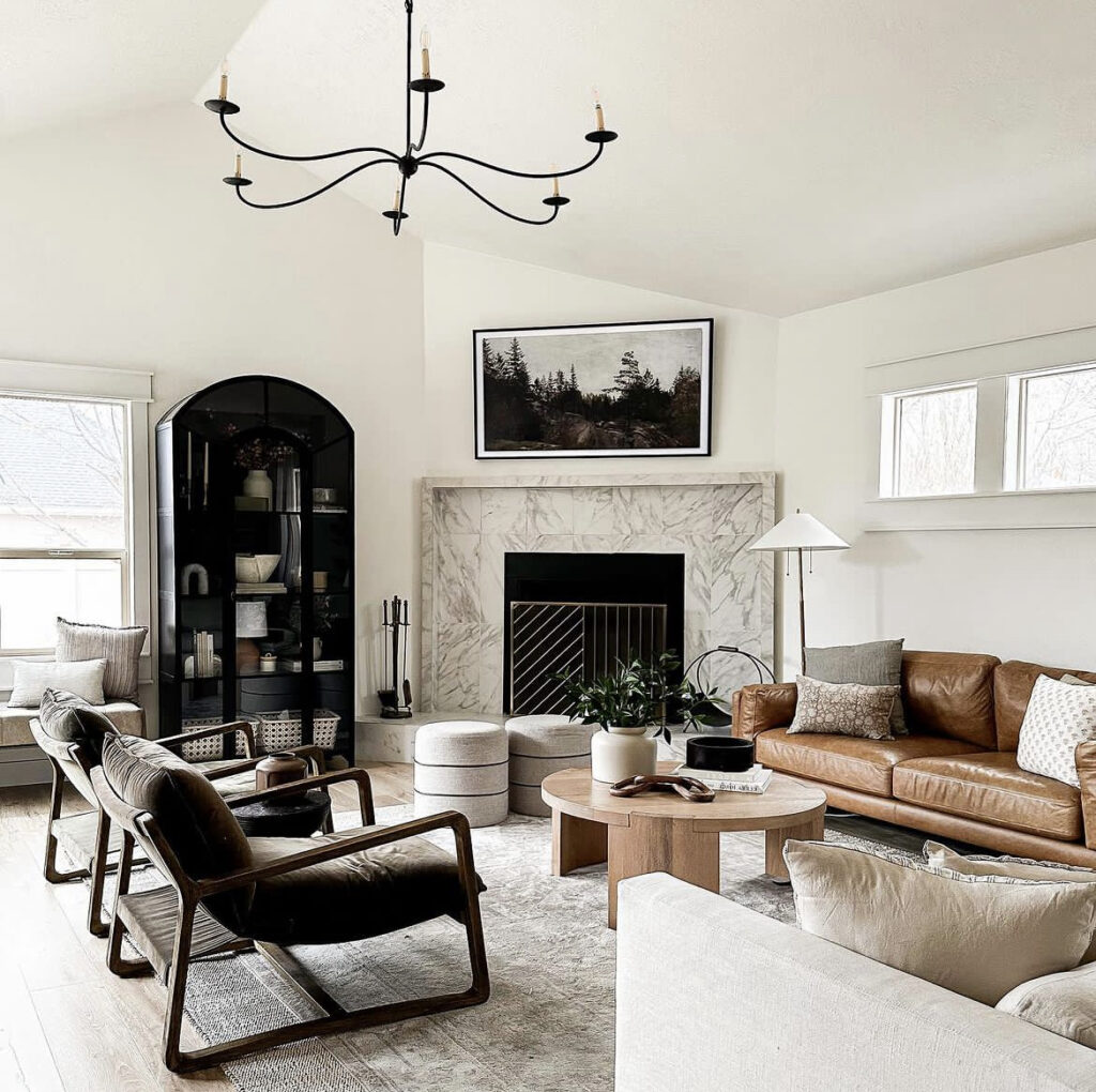
Finally, you can arrange the furniture as you would anyway. This technique is especially ideal when you don’t think the fireplace will get much use. Center the furniture around the main wall instead of the angled fireplace, using a large piece of wall art, curio, statement bookshelf or frame tv (a super cool tv that looks like artwork when you’re not using it). The best example of this I’ve seen is designed by Irina Mazhukhin @mintandpinedesign referenced below.
Design Dilemma #4 – Random Light Fixture Placement
A randomly placed light fixture can throw off the balance of a room, but there are a few techniques to handle this design dilemma. Whether adding more lighting or other designs elements, the goal is to distract from the lighting that’s placed oddly or make desired changed to create symmetry.
First, consider additional lighting. Using additional light fixtures strategically can help balance out the room. For example, if the awkward light fixture is on one side of the room, consider adding a matching fixture on the other side to create symmetry. Alternatively, you could use floor lamps or table lamps to add additional lighting to the room and space out the lighting equally to create symmetry.
Another option is to create a focal point in the room that draws attention away from the weirdly placed light fixture. Some options are a piece of e scale artwork, a decorative mirror, or a piece of accent furniture placed strategically in the room. By creating a focal point, the eye will be drawn to that area instead of the awkward light fixture placement.
Next, you could consider changing the light fixture altogether. There are many modern and stylish light fixtures on the market that can add a beautiful focal point to the room while also providing ample lighting. This way, instead of working against the odd light fixture placement, you can play it up with something beautiful and intentional you want people’s eyes to be drawn toward.
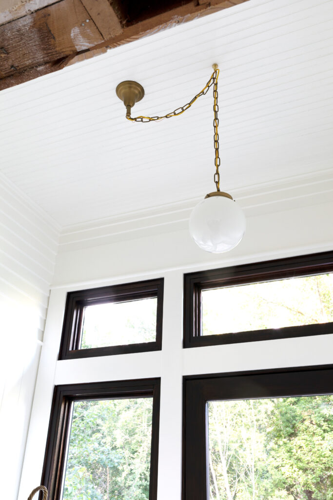
Lastly, if the light fixture is a chandelier, you can even swag it over to center it. This can create the illusion that the light fixture has always been centered and the swagger chain or cord is intentional for added character. The photo below is a great example of this. Check out the photos below from The Grit and Polish. They have a wonderful in depth tutorial on swagging a light fixture to create symmetry.
Takeaway
Creating symmetry in a room is a great way to make it feel more organized, balanced, and put together. We know not every room has the most ideal floor plan or features; But with a little creativity and some careful planning, you can transform an any into a functional and stylish space that you’ll love, no matter the design dilemmas you may encounter.


